
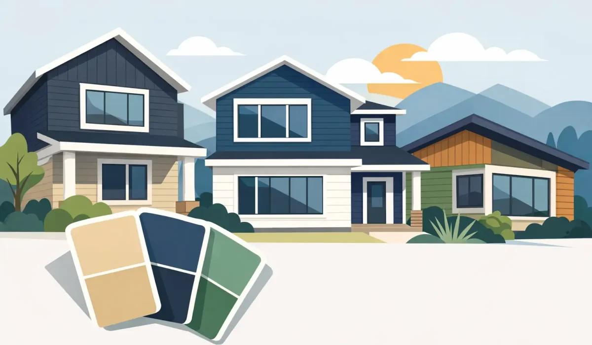
A modern exterior can lose its impact quickly when the siding, trim, and roofline details compete instead of working together. The best modern siding color combinations do more than follow a current trend. They clarify the home’s architecture, highlight quality materials, and maintain a clean appearance through changing seasons.
For custom homes and substantial exterior renovations, color selection should be planned alongside the full exterior scope: siding or cladding, soffit, fascia, eavestroughs, downspouts, windows, doors, masonry, and roofing. A thoughtful palette gives every component a role. Just as importantly, the materials and finishes must stand up to moisture, UV exposure, temperature swings, and day-to-day maintenance demands.
Start With the Home’s Permanent Elements
Siding can be replaced. Brick, stone, roof shingles, window frames, and hardscape are usually far less flexible. Begin with these fixed features before narrowing down a siding color.
A warm red or brown brick facade generally works better with warm whites, taupes, charcoal-browns, and natural wood tones than with blue-gray siding. Conversely, a home with cool gray stone, black windows, and a dark roof can support crisp whites, soft concrete grays, deep charcoal, or black accent cladding.
The roof deserves special attention. Dark roofing is common on contemporary homes, but it does not require black siding. In fact, pairing a black roof with a lighter main body color often creates better definition and prevents the house from looking visually heavy. Use black selectively on window surrounds, front-entry details, metal panels, or a recessed upper volume.
The Most Effective Modern Siding Color Combinations
The right palette depends on the architecture, natural light, lot setting, and material profile. These combinations consistently work well because they create clear contrast without making the facade feel busy.
Warm White, Black, and Natural Wood
Warm white siding with black window trim and wood-look or real cedar accents is a reliable choice for modern farmhouse, transitional, and contemporary custom homes. The white should have a slight warmth rather than a stark blue cast, particularly beside limestone, beige mortar, or warm-toned concrete.
Black works best as a framing color in this palette. It can define the entry, garage door, soffit line, or a narrow vertical section of cladding. Wood adds needed texture and prevents the contrast from feeling overly sharp. Longboard-style aluminum or other high-performance wood-look cladding can deliver this visual warmth with less maintenance than natural wood in exposed locations.
The trade-off is upkeep. Bright white siding shows road dust, splashback, and mildew more readily than mid-tone finishes, especially near landscaping and lower rooflines. Proper drainage, flashing, and eavestrough placement help keep the exterior cleaner.
Charcoal Gray, Light Gray, and Black Details
A layered gray palette is well suited to homes with stone, concrete, and large contemporary window openings. Use a medium or charcoal gray as the principal siding color, then introduce a lighter gray or off-white on a projecting section, upper story, or sheltered entry wall. Black fascia, windows, and metal accents bring the composition into focus.
This approach is more forgiving than a pure black-and-white exterior. Mid-tone gray hides normal exterior dust better than white, while the lighter section prevents a large elevation from becoming too dark. Vertical siding panels can also help make narrow walls appear taller and more deliberate.
Avoid using several similar grays with no meaningful contrast. If the siding, stone, roof, and trim are all nearly the same value, the facade can look flat from the street. A strong light-dark difference or a clearly distinct texture is needed to create depth.
Black, Wood, and Soft Stone Tones
Dark exteriors remain popular for modern builds, especially when paired with pale stone and warm wood cladding. Black aluminum, composite, or metal siding can create a sharp architectural statement, while wood accents at the entry, covered porch, or second-floor volume keep the design grounded.
This combination works best when black is balanced with generous glazing, light masonry, or open areas around the building. On a heavily shaded lot, a home finished almost entirely in black may feel more imposing than intended. A softer charcoal can produce much of the same effect while revealing more of the siding profile and texture.
Material selection matters with dark colors. Dark cladding absorbs more heat, so the system should be professionally installed with the appropriate fastening, ventilation, expansion allowances, and flashing details. The visual finish is only one part of a successful exterior envelope.
Beige, Greige, and Bronze
Not every modern home needs a high-contrast palette. Greige siding, light beige stone, bronze windows, and wood-toned accents create a quieter luxury look that suits many established neighborhoods. This is particularly effective where a homeowner wants a contemporary update without a dramatic black facade.
Bronze is a useful alternative to black because it introduces depth with less severity. It pairs naturally with cedar, tan brick, cream stone, and warm gray siding. A darker bronze fascia or square seamless eavestrough can give the roofline a refined outline without becoming the focal point.
The key is consistency. Cool gray siding beside yellow-beige stone and bronze trim can look disconnected. Select samples outdoors, next to the actual brick or stone, and review them in morning sun, afternoon light, and overcast conditions.
Deep Green, Black, and Wood
Deep green is a strong choice for homes near mature trees, ravines, or landscaped lots. It offers more character than charcoal while remaining restrained enough for a modern elevation. Pair it with black windows and trim, then add natural wood at the door surround, soffit, or feature wall.
Green has more variation than many homeowners expect. Some shades lean blue, others olive, and others nearly black in low light. The surrounding materials determine whether the color feels sophisticated or out of place. Test full-size samples before committing, particularly on north-facing elevations where colors appear cooler and darker.
Use a 60-30-10 Approach Without Making It Formulaic
A practical starting point is to assign roughly 60 percent of the visible facade to a main siding color, 30 percent to a secondary material or color, and 10 percent to high-contrast accents. This is not a strict rule, but it helps prevent the common mistake of giving every exterior material equal visual weight.
For example, a light gray main siding may cover most of the home. A charcoal vertical panel section can define the garage or upper floor, while black window trim, fascia, and front-door hardware provide the final accent. The result feels composed because the eye understands what is dominant and what is secondary.
On a smaller home, simplify further. Two primary colors plus one accent are often enough. Large custom homes can handle more material variation, but each transition should align with an architectural break, such as a recessed wall, floor line, entry mass, or change in roof form. Random color changes across a flat wall tend to look decorative rather than intentional.
Coordinate Siding With Soffit, Fascia, and Eavestroughs
Roofline components are frequently treated as afterthoughts, even though they are visible from nearly every angle. Their color can either reinforce the siding design or interrupt it.
For a clean contemporary finish, black or dark bronze fascia and eavestroughs pair well with black windows and dark accent cladding. Light-colored soffit can brighten overhangs and make a deep roofline feel less heavy. On a more monochromatic home, matching the eavestrough color to the fascia creates a quieter, more integrated edge.
Performance should guide the decision as well. Eavestroughs, downspouts, flashing, soffit ventilation, and fascia protection all need to function as one coordinated system. A premium siding palette will not compensate for poor water control at roof edges or improper drainage near the foundation.
Consider Light, Maintenance, and Resale Value
A color that looks excellent on a design board may behave differently on an exposed elevation. White reflects heat but shows dirt. Black and deep tones can be striking but show pollen, salt residue, and surface imperfections depending on the material. Mid-tone gray, greige, and muted green generally offer a practical balance between visual depth and everyday maintenance.
For resale, the safest modern palettes are not necessarily plain. They are cohesive. Buyers respond well to a home that has clear proportions, durable materials, and a restrained relationship between siding, windows, roofline, and entry details. A bold feature color can add personality, but the main exterior should still make sense with the neighborhood and the architecture.
Choose Samples on the Actual Elevation
Small chips are useful for narrowing choices, but they cannot show how a color will read across a full wall. Request larger samples and place them beside the roof, masonry, window frame, and any proposed accent material. View them from the curb as well as up close.
This step is especially valuable for aluminum, composite, PVC, vinyl, wood, and metal cladding because sheen, panel direction, and joint layout can change how the color appears. Horizontal panels may read differently from vertical D5-style panels, and a matte finish may look softer than the same color in a higher sheen.
A well-planned exterior palette should make the building look intentional before anyone notices the individual materials. When the color plan is coordinated with professional cladding installation, roofline finishing, ventilation, and drainage, the result is not simply stronger curb appeal. It is a cleaner, more durable exterior built to perform for years.